


Design Leadership & Transformation: Scaling a Global Media Platform from the Ground Up
Design Leadership & Transformation: Scaling a Global Media Platform from the Ground Up
I was brought on to lead the end-to-end digital transformation of Fair Observer. This wasn’t just a visual redesign; it was a foundational rebuild of the design function itself. I inherited "information chaos" and a fragmented workflow, and I transformed it by building a cross-functional team, establishing a strategic roadmap, and architecting a scalable 80+ component design system. This project demonstrates my ability to lead teams through complex structural changes while maintaining high-quality standards.
I was brought on to lead the end-to-end digital transformation of Fair Observer. This wasn’t just a visual redesign; it was a foundational rebuild of the design function itself. I inherited "information chaos" and a fragmented workflow, and I transformed it by building a cross-functional team, establishing a strategic roadmap, and architecting a scalable 80+ component design system. This project demonstrates my ability to lead teams through complex structural changes while maintaining high-quality standards.
Design Leadership, Team Mentorship, Information Architecture, Product Strategy, Systems Design
UI/UX, Brand & Web Design, Design System
October 2024 - Present
October 2024 - Present
Platform: Web + Mobile
Platform: Web + Mobile
Tools: Figma, Google Analytics, Hotjar, Figjam
Tools: Figma, Google Analyrics, Hotjar, Lookback
Strategic Leadership & Governance
Strategic Leadership & Governance
Building the Machine
Before a single pixel was moved, I focused on establishing the Design Operations needed to sustain a global platform:
Team Orchestration: I recruited and led a cross-functional team of interns and developers, establishing a culture of design reviews, critiques, and accountability.
The Roadmap: I defined the product vision and created a phased execution roadmap, ensuring that our "scrappy" resources were focused on the highest-impact structural wins.
Workflow Integration: I bridged the gap between Editorial and Engineering by implementing a Jira/Confluence-based handoff system that eliminated communication silos.

The Problem (Information & Operational Chaos)
The Problem (Information & Operational Chaos)
Fair Observer lacked the infrastructure to support its mission. The platform faced three levels of failure:
Operational: No shared design language or workflow, leading to massive engineering friction.
Structural: A decade of content growth had broken the Information Architecture, making 2,500+ articles nearly impossible to discover.
Responsive: The site was functionally broken on mobile, alienating a global audience that relies on handheld devices for news.
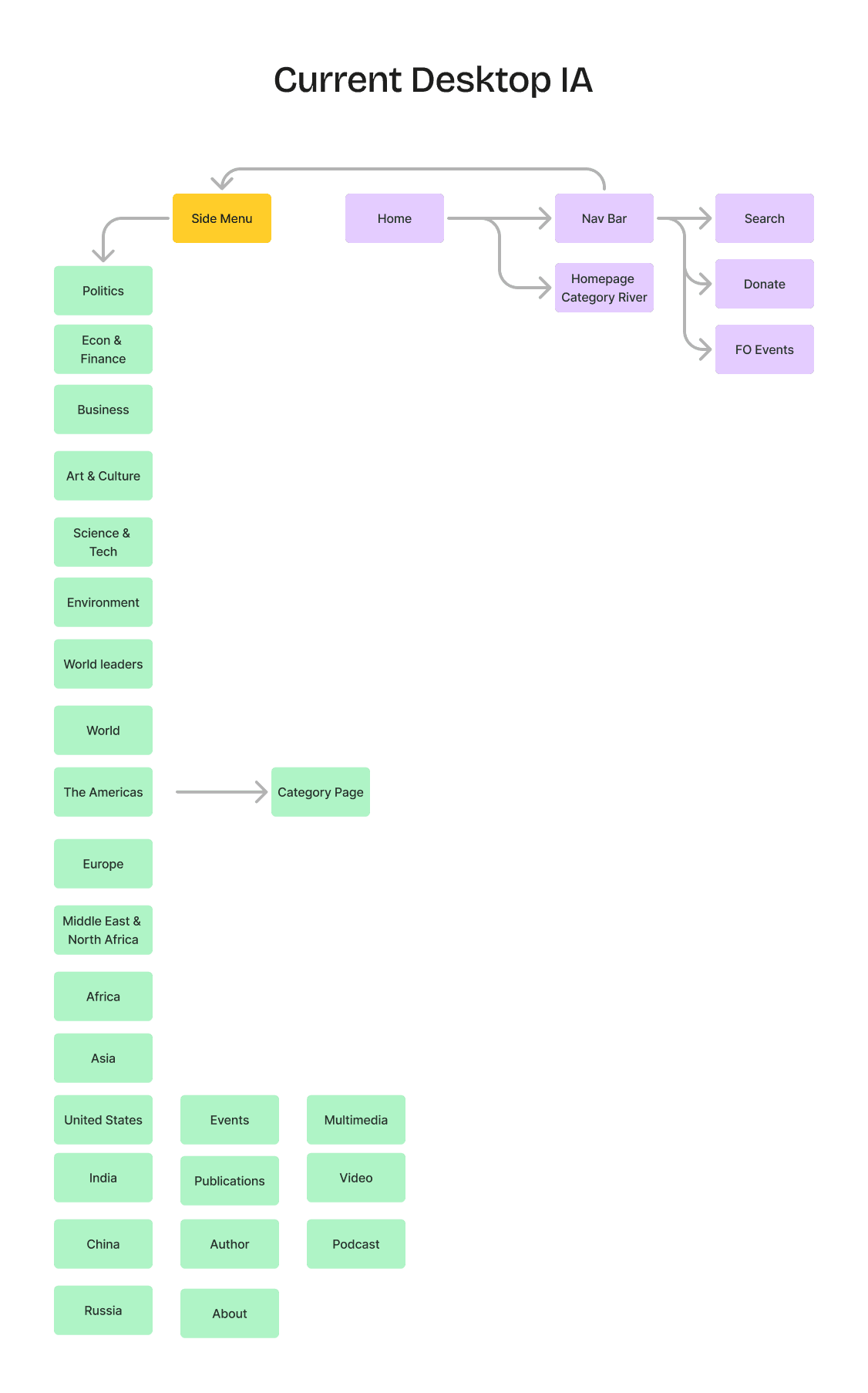
Figure 1: Visualizing the legacy site's 'flat' architecture, where 20+ top-level categories created choice paralysis, hidden in the menu, and a 50% drop-off in deep-archive discovery.
Figure 1: Visualizing the legacy site's 'flat' architecture, where 20+ top-level categories created choice paralysis, hidden in the menu, and a 50% drop-off in deep-archive discovery.
By mapping the navigation flow, I identified that primary content discovery was gate-kept behind a side-menu overlay, increasing cognitive load and interaction cost for the user
By mapping the navigation flow, I identified that primary content discovery was gate-kept behind a side-menu overlay, increasing cognitive load and interaction cost for the user
Goals (The Architect's Vision)
Goals (The Architect's Vision)
Establish Leadership: Create a standardized design process from discovery to handoff.
Reconstruct the IA: Completely overhaul the site’s categorization and sitemap to prioritize content discoverability.
Architect Scalability: Build a foundational 80+ component system to allow the platform to grow without adding technical debt.
Modernize the UX: Execute a full responsive redesign that balances editorial depth with modern usability.
Research & Structural Insight
Research & Structural Insight
Instead of just looking at colors, I audited the logic of the platform:
Instead of just looking at colors, I audited the logic of the platform:
🧠 The IA Audit
I mapped out the existing categorization and found that overlapping tags and a deep hierarchy were causing a 50% navigation drop-off.
🧠 The IA Audit
I mapped out the existing categorization and found that overlapping tags and a deep hierarchy were causing a 50% navigation drop-off.
🧠 Stakeholder & Editorial Input
I met with Editors and Developers to find the "middle ground"—a design that satisfied editorial complexity but stayed within our engineering bandwidth.
🧠 Stakeholder & Editorial Input
I met with Editors and Developers to find the "middle ground"—a design that satisfied editorial complexity but stayed within our engineering bandwidth.
🧠 Systemic Benchmarking
I analyzed how top-tier news organizations handle "infinite content" to develop our own modular framework.
🧠 Systemic Benchmarking
I analyzed how top-tier news organizations handle "infinite content" to develop our own modular framework.

Figure 2: The redesigned modular architecture. By introducing a tiered taxonomy, we created a scalable framework that supports diverse media types and improves SEO.
Figure 2: The redesigned modular architecture. By introducing a tiered taxonomy, we created a scalable framework that supports diverse media types and improves SEO.
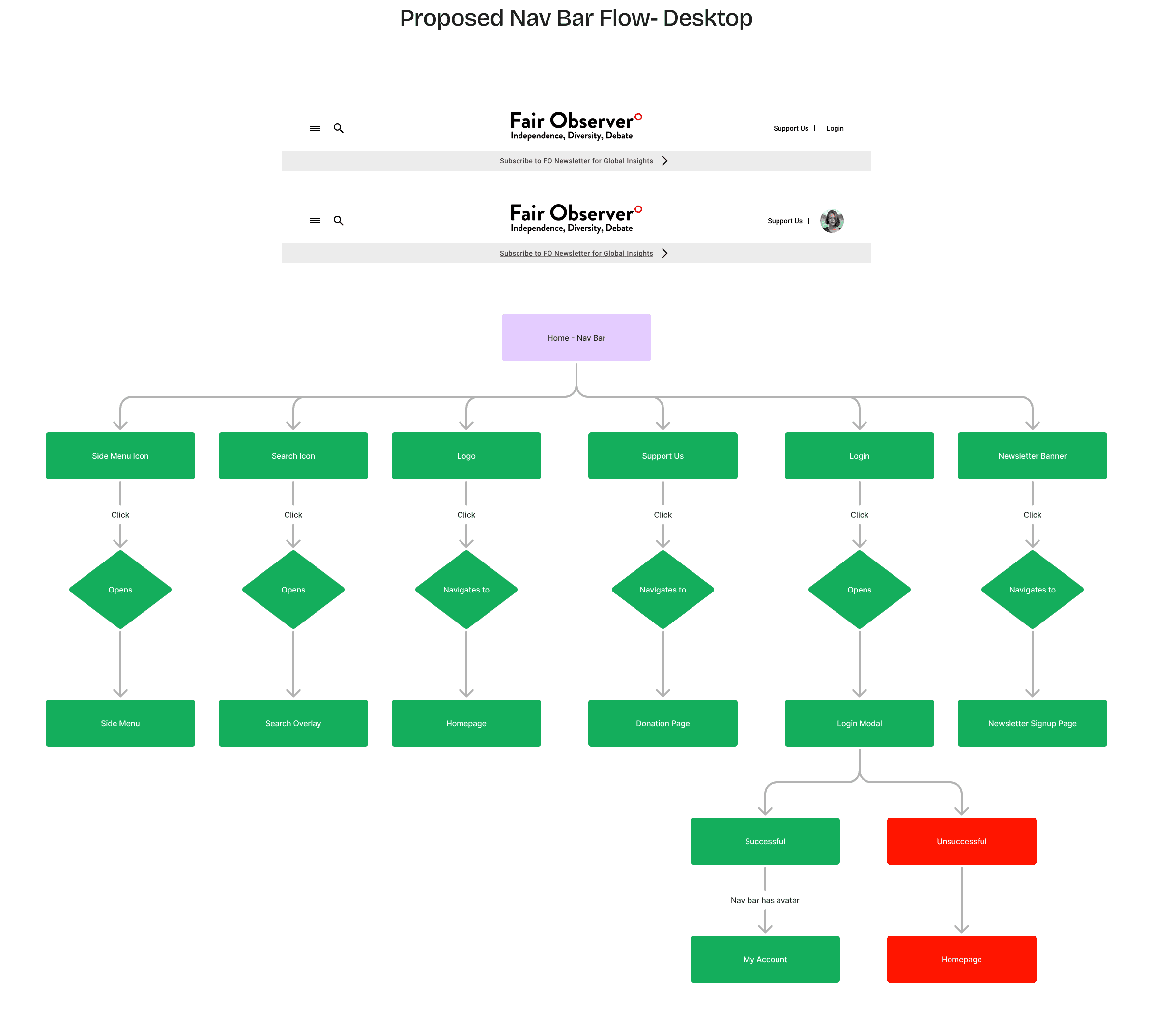
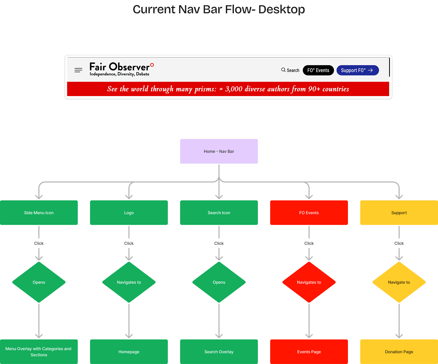
Figure 3: Optimized Discovery Flow: Replacing 'gate-kept' navigation with a tiered taxonomy to improve content findability for 2,500+ global articles.
Solutions & Process (The Execution)
Solutions & Process (The Execution)
✨ Foundational Site Maps
I led the team in a total restructuring of the site’s sitemap, moving from a "folder" logic to a "tag/topic" logic to improve SEO and discovery.
✨ Foundational Site Maps
I led the team in a total restructuring of the site’s sitemap, moving from a "folder" logic to a "tag/topic" logic to improve SEO and discovery.
✨ Modular System Architecture
I built an 80+ component library in Figma. By establishing these foundational "atoms" first, I empowered the junior designers to build consistent pages at 3x the original speed.
✨ Modular System Architecture
I built an 80+ component library in Figma. By establishing these foundational "atoms" first, I empowered the junior designers to build consistent pages at 3x the original speed.
✨ Full Responsive Redesign
I oversaw the transition to a mobile-first philosophy, ensuring that long-form articles were optimized for readability across all device breakpoints.
✨ Full Responsive Redesign
I oversaw the transition to a mobile-first philosophy, ensuring that long-form articles were optimized for readability across all device breakpoints.
✨ Mentorship & Handoff:
I personally mentored the design team on Figma best practices and "Engineer-first" documentation, ensuring that our Jira tickets were production-ready.
✨ Mentorship & Handoff:
I personally mentored the design team on Figma best practices and "Engineer-first" documentation, ensuring that our Jira tickets were production-ready.
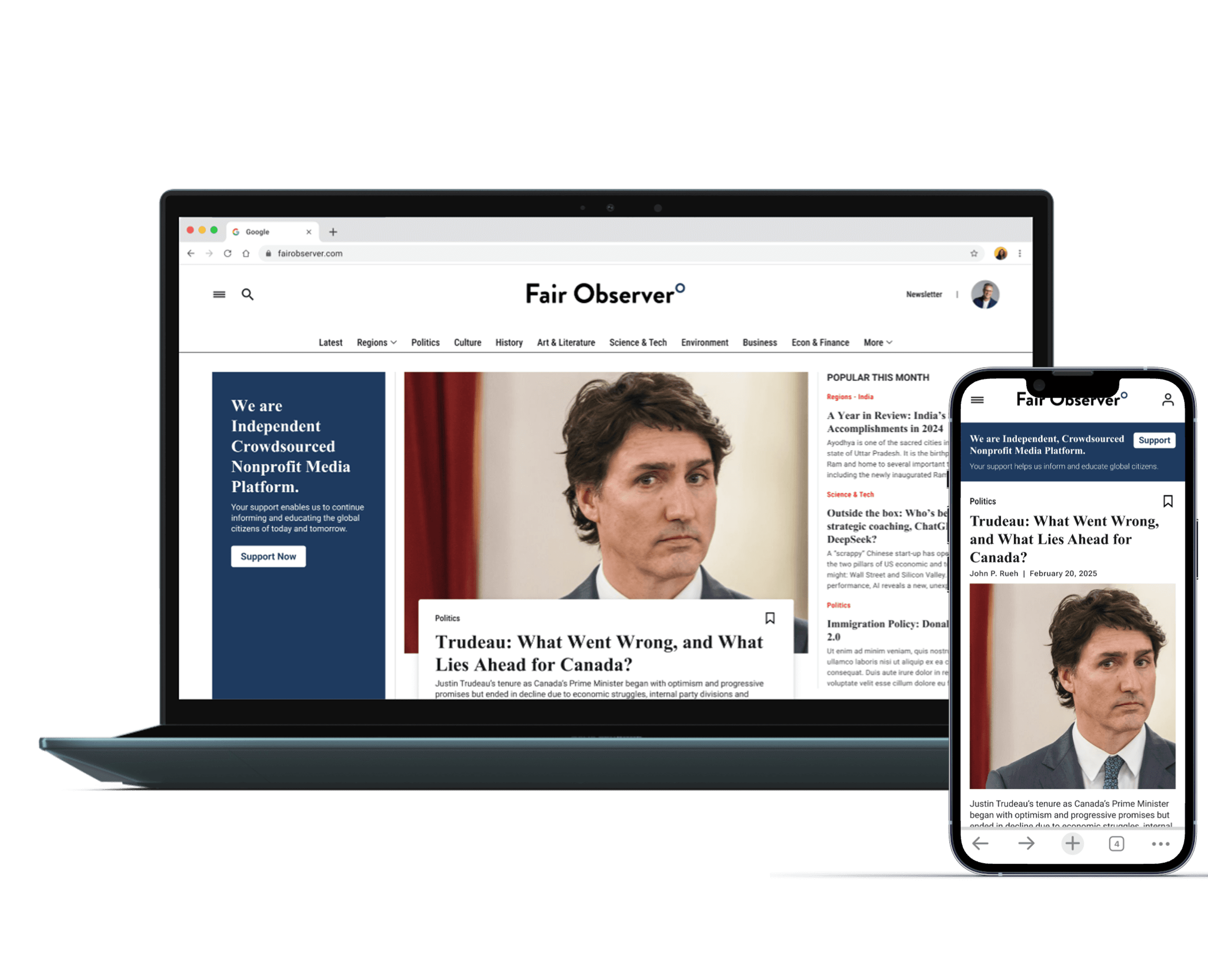
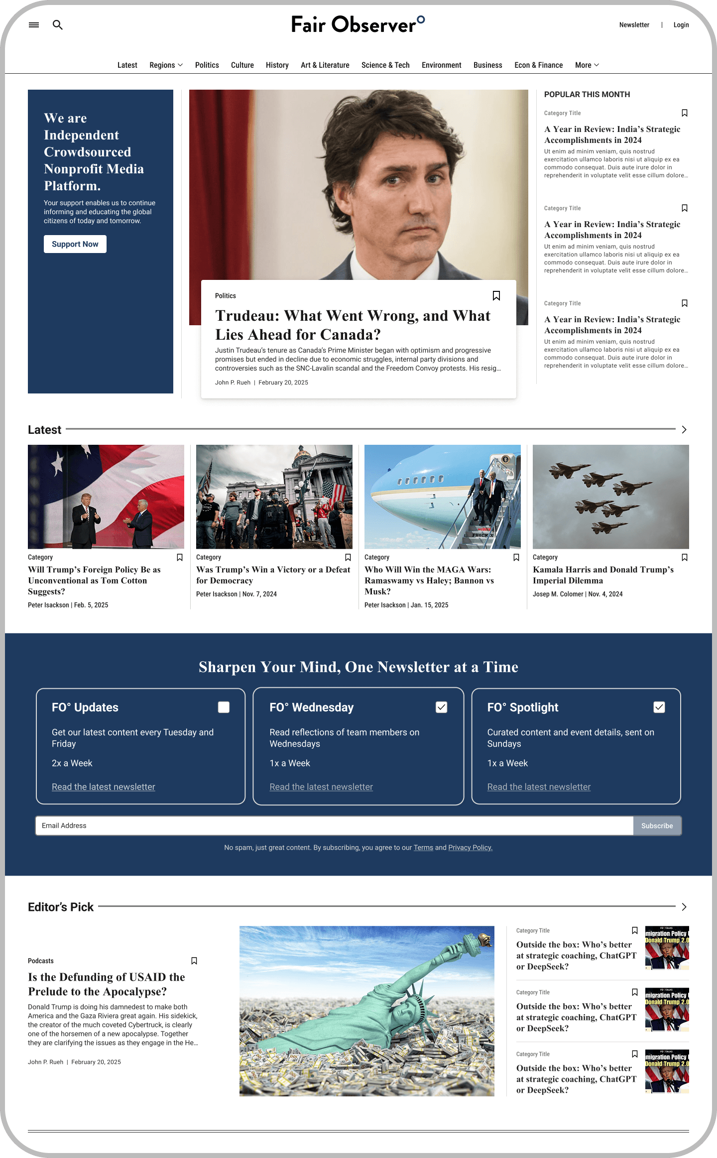
Current Design

New Design
Impact & Metrics
Impact & Metrics
Operational Transformation: Built a high-functioning design team and workflow from zero.
Production Readiness: Delivered a full-site redesign and 80+ component system that reduced estimated build-time by 30%.
Structural Integrity: Successfully re-categorized a 10-year archive into a modern, searchable IA.
Systemic Growth: Created a "Design Playbook" that allows Fair Observer to scale its digital presence without needing constant design oversight.
Reflection
Reflection
This project was my debut into Design Leadership. I learned that the most important thing a Lead Designer builds isn't a screen, it's the team and the system that allows those screens to exist. By focusing on sitemaps, IA, and team governance first, I ensured that Fair Observer didn't just get a "new look," but a sustainable platform for the future of journalism.
This project was my debut into Design Leadership. I learned that the most important thing a Lead Designer builds isn't a screen, it's the team and the system that allows those screens to exist. By focusing on sitemaps, IA, and team governance first, I ensured that Fair Observer didn't just get a "new look," but a sustainable platform for the future of journalism.